Tuesday, 7 February 2012

Contents Page log

BOLD AND UNDERLINED: Contents Page log


I have finished my contents page and put the two pages together. The pictures I didn’t use for my front cover I decided to use for the inside page of my contents page. The model I used for the front picture is the same person I used here; the general feel for the magazine is that it’s relaxed and friendly so I didn’t want pictures that looked too professional. In a different font I have the name ‘BOLD’ but in a different font on the parallel page so that it flows well and it next to the picture of the weeks issue.

The colours by themselves looked really dull so by having the brighter contrasts contrasted with the faded grey it works well. I wanted to be a bit different and instead of having a message from an editor on the far right side I had a letter from an agony aunt – as this is a reality magazine I thought it worked well. However, by having a picture of the agony aunt next to the text it made it look over the top so I took the picture out and just had her name in a signed font at the bottom of the note.
I used the same fonts throughout the page so it didn’t look strange and it made it same well structured and had a good layout, I made sure the fonts (although in different colours – for numbers – and sizes) were similar and worked well together. I did this buy trying out most of the fonts available and choosing the two that worked well together.

I didn’t use all original images on my contents page but I edited them all so that they weren’t completely un-original and my own stamp was on them. Although, for my competition picture it’s a mixture of the two; I edited the picture so that my picture (My Grandmother) stood in front of the Statue Of Liberty in a pose that in the magazine won the top prize/slogan. I didn’t want to not use my own images but when ones I found and edited looked slightly better it was worth it.  I edited the pictures on an online programme called Picnik which allows you to change nearly every aspect of your picture – if you’re a premium member! The picture above is one of my images but I adjusted the brightness and contrast to make it look slightly more professional.

My contents page originally looked like this.


I didn’t want to change too much about it as I liked the agony column and the ‘What Lies Inside’ on the left hand side. However, the layout in the centre of the page did not look well structured it looked too cluttered in some places and the blank section on top right hand side made the whole page look unprofessional and tacky.
In order to make it look better – in my opinion – I firstly took the black outlines off the rectangles around the page and changed the angles of some of the shapes and photos. I didn’t think the overlapped pictures looked effective. Also, I didn’t think they worked well with the story headlines.
Therefore, I took out all the pictures (excluding the front cover screen shot at the top) and deleted them from the page completely. I think took some photos from Google and edited them slightly to work better with the page, I surrounded them in a border in a similar colour to the blue boxes. I gave them short headlines that matched well with those I had already categorised. I moved my text further left and centred it so it filled up the available space better. On the opposite page I had more stories and downloaded pictures but I thought it looked too intimidating and like too much text, in order to make it look more attractive I ditched that idea and using the same girl from my front cover, donated a page completely too her.

After looking through my final draft of my magazine I realised that Alice - my model, was featured too much so I have decided to leave her on the front cover but take her off the contents page and use another model for my double page spread.

Tuesday, 31 January 2012

Feature Article Research

Feature Article Research - 10 what and why questions


1)      Why have you brought out certain points from the article?
Bringing out quotes in a bigger font and brighter background makes them look more intriguing and you want to read more of the article to find out how it got to that point, who did it etc… and because they have put it the centre of the article you don’t know where it was drawn from.
2)      Why have you highlighted certain points?
Throughout the text you can see certain point’s highlighted. This is the section where the interviewer has asked (in this case) Camilla questions. In order for it to stand out and not look like something she has said in her sentences/answers, the publisher has highlighted them in a bright colour so you know where the separation is.
3)      Why have you used before and after shots?
Like the other article there has been a drastic change for this woman. She underwent hard core dental surgery and came out the other side another woman. The article only tells us the mental side of things – we can only imagine what she must look like now, but with pictures not only does it make it more interesting but it also enables us to put a face to the story and enjoy it more.

4)      Why have you got a picture of her teeth by itself as apposed to being with the rest of the pictures?
Dental surgery is the only surgery she had done, there was no need to show the spray tan, shopping trip and hair cut she had to finalise her look in the final picture. The whole article is based upon her teeth and that is what the reader wants to read about. In the ‘before’ picture you can only see a small margin of her teeth but in the below picture you can see her teeth in all their ‘glory.
5)      Why have you used rhythmic words to title the transformation?
Plastic surgery always seems like a scary idea to anyone who’s considering undergoing it, so that is a reasonable title for the first article. But the second one is entitled ‘plastic fantastic’ is it implying that because it worked out so well for her, SHE is fantastic? Or is it putting across a subliminal message – plastic IS fantastic? After all they are willing to pay £500 at the bottom of the page for anyone with a good story.
6)      Why have you put the price and of the surgery on the article?
By putting the price that Camilla paid to undergo surgery it makes the story seem more realistic. It is there to make a point; anyone that wants decent looking plastic surgery has to pay a price – no matter how big.
7)      Why have you placed the images in the places you did?
The pictures at the top of the page are well placed and look effective in their places, they are slightly over lapping and are outlined with a white border to stand out against the bright pink background, they immediately look eye-catching and you want to read on.

Monday, 30 January 2012

Feature Article Research

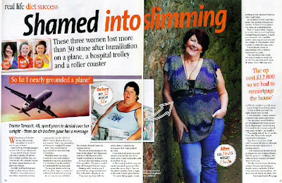
      Feature Article Page


1)      Why have you used before and after effect for this article?
To show the drastic change between the two images, a before and after is very effective. It shows a lot of women how losing a few stone can make a huge difference. It inspires a lot of women because not only read about how and why the woman changed her life but they can see it too.
2)      Why have you used an un-original image to prove a point?
In this true story a big aspect is why she lost weight. In the article it explains that an air hostess put her down and said she was so fat she almost grounded the plane. This event turned her life around and made this story true; because it happened on the plane it’s appropriate to have an image of one. However, it’s not that easy to get a good shot of a plane in flight so an un-original image (slightly edited) is very effective for this piece.
3)      Why have you interviewed all three women but only shown ones story?
Although all the women in this article have gone through a rare event to lose the weight they have, this particular women lost 18st which was by far the largest amount of weight lost, so it only made sense to show the most dramatic story.
4)      What made the layout so effective?
The layout is effective because it’s easy to read. The sections of writing are placed evenly around the pictures and a slim article is against a full body picture on the right hand side. It doesn’t look too intimidating and they titles and quotations make it look intriguing.
5)      Why on a double page spread have you used one page for images?
By separating the text by having one page primarily for a main full body image it makes the overall appearance of the feature page nicer and it looks less intimidating and friendly. Also it makes the ‘before and after’ picture effect more apparent as you can clearly tell what she was like then, and how she is now.

6)      Why have you overlapped the two images?
The two pictures are overlapped with the transparent arrow to show that they are actually the same people and it’s not two people edited to look the same. By overlapping the pictures it makes it look more cluttered but less structured which gives it a friendlier vibe.
7)      Why have you used the title ‘Shamed into slimming’ rather than a simpler title?
The title is one of the catchiest slogans on the whole page and the two contrasting colours along with the wording make it really eye-catching. You immediately want to read this article due to the fact the colours and wording make the whole page look more interesting.
8)      Why have you got the category of the article in the corner?
This story although it has a happy outcome and back story is based upon an air hostess bullying one of the passengers into realising how overweight they really were and lose 18st. But by simply putting ‘diet success’ in a small font behind the title it gives the page an immediate happy feeling as you realise how far this woman has come not only mentally but physically too.


Tuesday, 10 January 2012

Contents Page Summary


Contents page summary

I have learnt that contents pages are like the starting point and map of a magazine.
Excluding the front cover they are the first page that the reader sees so it has to link in with the front cover so it flows and doesn’t feel unstructured.

In order to make it a good contents page it shouldn’t be over crowded and the headlines of the articles or the categories they go under need to stand out so they draw in the reader’s attention. Although it is good to have colour on your page and different fonts it can look too cluttered keep it subtle and to a minimum. However, this is also compliant with the genre of your magazine and the kind of audience that reads it, if it was a teenage magazine you would expect something more along the lines of Teen Vogue:


(September Issue 2011; Teen Vogue)


 But if the magazine you are selling is a “hard” music magazine then a layout which is quite dark with flashes of bright colours well make more of an impact, stand out more and suit your target audience.

I’m going to use the information I’ve learned to help me construct the most suitable contents page for my magazine. I’m going to have a plain background like Vogue so that I have a broader range of colours to use for my pictures, ads and fonts.

Monday, 9 January 2012

Contents Research


10 what and why questions on contents page

1)      Is there a specific theme to this issue?
Taylor Swift is best known for her song ‘Love Story’. By placing hearts all around her and the categories it links into the background of the image (chalk board) and the book in her hand (denoting the idea of LOVE STORY)

2)      Why have you used the slogan “ Get to know the ‘real’ Taylor Swift”?
Taylor Swift is a teen pop singing “sensation” but has been shown in different lights, from being “easy” to being a teachers pet. This issue is set out to close rumours over the singer and let people meet the ‘real’ her.

3)      Why have you used a photo of Taylor Swift in a classroom?
The picture of Taylor Swift leaves much to the imagination. The books and objects placed around her makes you wonder if she’s intelligent. The background (chalkboard) has lyrics written on, telling you her interests. The way she is sitting is friendly and the angle on her foot shows her tattoo of a love heart, the same looking love heart placed around the contents page.

4)      Why haven’t you put the headlines under catergories?
      This is a teen magazine which means it has a more laid back appearance and has a younger appearance. As soon as you place the articles under headlines you’ve given it a more structured and mature layout which can look a bit out of place in a young person’s magazine.

5)      Why have you used the image of hearts all over the page?
The looks placed over the page numbers relate to the tattoo in her left foot. It is a rough heart in a hand drawn shape, similar to those teenage girls draw over their hands in school. It just gives the page a ‘sweeter’ feel.

6)      What makes the stories relate to the genre of the magazine?
      The genre of the magazine is Teen Gossip, the story titles relate to the genre by making them catchy such as ‘Behind the Scenes’. You immediately want to know what happened behind the scenes and why it’s so interesting.

7)      Why have you only got ONE image?
This issue is primarily based on Taylor Swift – she is their main story so she is their main image. They are selling her image so in response she is theirs.


8)      Why have you chosen a white background?
They have chosen a white background so that they didn’t have to choose fonts to over powering and it can look more sophisticated. It makes it look nicer to the eye rather than a clash of colour.

9)      Why isn’t the web address shown?
Teen Vogue is a well known teenage magazine so they don’t need to broadcast their magazine name all over the page, they rely on word of mouth to tell people about the publication and then people search it themselves.

10   Why is the contents page on ONE page?
These are their main stories, in order to not over power the page they have limited the amount of programmes shown so, they only NEED one page.

Monday, 19 December 2011

Contents Research

BOLD: 10 what and why questions on the contents page


10 what and why questions on this contents page

1)      Why have you chosen these font colours?
- By choosing black as the overall font colour it makes it more understated and not the main attraction. This has a positive and negative effect; it isn’t cluttered by lots of different colours clashing together and making it seem like a lot of effort to read. However, it also makes it quite boring and not interesting which means that the buyer might not be drawn into reading it and seeing what it says. The publisher will rely on the fact that the front cover has enticed the reader enough to by pass the understated look of this page.
2)      Why have you chosen to duplicate the bright design on either side?
- By duplicating the design on either side of the page its eye catching and not over the top so it makes it look more mature, it connotes the idea that this is for the older audience because of its formal articles and artistic imagery.
3)      Why have you chosen to divide the page up?
-  They have divided the page up like this to make it separated and easier to read. It doesn’t look cluttered and it gives the impression that the whole magazine is accessible and a good read for a short journey.
4)      Why have you chosen to place the web address there?
- They have chosen to put the web address at the bottom because it’s isolated from all the other text and imagery. By placing it by itself it draws you in too see what is by itself. Because it isn’t surrounded by other text it makes it more memorable so you’re more likely to search it when you get home.
5)      Why have you chosen to have a white background?
- They have chosen a white background so there décor, text and imagery stands out and isn’t hidden by a bold background.
6)      Why are the images scattered around the page?
- The images are scattered around the page so that not one corner of the contents page looks cluttered, by spreading out the pictures it also makes the pictures stand out as individuals and you can look at each picture separately and in your mind make your own interpretations of what it denotes.  
7)      Why haven’t they put the name of the magazine on the contents page?
- The reader knows what magazine they have picked up and so doesn’t need to be reminded of what the magazine is called. Also because of the genre of this magazine it’s more formal and not informal like a gossip magazine which is the genre of magazine which is more likely to broadcast its title in every available space (e.g. Closer)
8)      Why haven’t they put the page number for every article (1-80) on the page?
- If they showed the article headline for every feature in this magazine the contents page would be filled to the sides, they have chosen to show only their important headlines or the ones they feel will appeal most to their target audience.
9)      Why have they chosen the feature labels they have?
- They have labelled the features the names they have, because of the stories underneath them. They have looked at the overall theme of each article and placed them into categories and then summarising the group has labelled them. One story however is isolated ‘Cover Story’. This will be the story which is the masthead on the front cover, so people know which story that relates too, it has its own category.
10)  What makes the stories relate the genre?
- The stories are all real life, reality story and as the genre of the magazine is reality, it all ties in well. It makes the magazine seem complete.

Contents Page Research

BOLD: Questions and answers on contents page


1)      How is the page organised?
-     The page is split in too and is neatly presented. It had headlined the different sections in the magazine and where to find those pages. They have connected the pictures to the text by assigning each picture to an article and labelling them with the right page number. They have done this so it is easier to read and more attractive to look at, by making it look this way with little to look at in terms or colour in the centre, you’re drawn to the bright decorations at the sides of the page and the pictures scattered around it.
2)      If it is divided into categories, how many are there? What are they? How many features are in each category?
-     This particular contents page is divided in two, and then divided into features there is 1 – 5 in each section. My magazine genre is reality, because of this I chose a contents page with similar stories. So, they features shown are: cover story, features, people, lifestyle and et cetera. By splitting the features into these groups and makes the magazine easier to read, more accessible and a better read because you’re not spending all your time searching for the right article.
3)      How many pages are in the magazine in total?
-     From the pages shown on the contents, I would say there are roughly 80 pages in this particular magazine. You can tell this because of the way the page is laid out. Next to each story’s headline or brief summary there is a page number to the left of it in a bigger font. It’s also bold like the name of the article it’s beside, however, the summary underneath it is in a smaller font and not bold. This is because it’s not a necessary piece of information.
4)      What colours are used?
-    The main consecutive colour on the page is black; the text, web address, boxes, picture backgrounds and lines are this entire colour. Although the idea of black all over connotes the idea of dark, mystery and even the unknown it’s contrasted with the bright décor around the page and the smaller images scattered around the articles, make it looks brighter and happier so you immediately realise that they have put those things in black so it’s not overpowering and it’s understated instead.
5)      How have images been used?
-    The images have been used to make the page more attractive and more exciting. If it had no images, the page would look dull and dingy especially with the black font. There are 3 main images at the top of the page which are the biggest size, although these are the biggest picture they don’t have the brightest colours: the main colour running throughout all three of these images is black (one wearing black & two with black backgrounds). They don’t have much in them either, one is a close up of a quizzical looking man and the other two are of people in medium shots looking away from the camera. Some of the main mode-of-address is at the bottom of the page in the smaller images where two images are close-ups of people looking directly at the camera. There is one image too the far right of the right page and it’s a bright reddish colour, although it’s not easy to work out exactly what the image is, it’s eye catching because of the colour.
6)      How is the text shown?
-    There is three different fonts on the page; the page title ‘CONTENTS’, the feature titles and the articles underneath the features. By making each different headline a different font it makes you more aware of where the separation is and makes the general layout of the page look neater, it also makes it more understandable.