Feature Article Page
1) Why have you used before and after effect for this article?
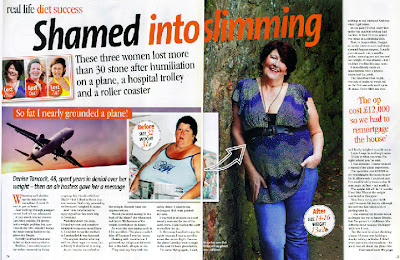
To show the drastic change between the two images, a before and after is very effective. It shows a lot of women how losing a few stone can make a huge difference. It inspires a lot of women because not only read about how and why the woman changed her life but they can see it too.
2) Why have you used an un-original image to prove a point?
In this true story a big aspect is why she lost weight. In the article it explains that an air hostess put her down and said she was so fat she almost grounded the plane. This event turned her life around and made this story true; because it happened on the plane it’s appropriate to have an image of one. However, it’s not that easy to get a good shot of a plane in flight so an un-original image (slightly edited) is very effective for this piece.
3) Why have you interviewed all three women but only shown ones story?
Although all the women in this article have gone through a rare event to lose the weight they have, this particular women lost 18st which was by far the largest amount of weight lost, so it only made sense to show the most dramatic story.
4) What made the layout so effective?
The layout is effective because it’s easy to read. The sections of writing are placed evenly around the pictures and a slim article is against a full body picture on the right hand side. It doesn’t look too intimidating and they titles and quotations make it look intriguing.
5) Why on a double page spread have you used one page for images?
By separating the text by having one page primarily for a main full body image it makes the overall appearance of the feature page nicer and it looks less intimidating and friendly. Also it makes the ‘before and after’ picture effect more apparent as you can clearly tell what she was like then, and how she is now.
6) Why have you overlapped the two images?
The two pictures are overlapped with the transparent arrow to show that they are actually the same people and it’s not two people edited to look the same. By overlapping the pictures it makes it look more cluttered but less structured which gives it a friendlier vibe.
7) Why have you used the title ‘Shamed into slimming’ rather than a simpler title?
The title is one of the catchiest slogans on the whole page and the two contrasting colours along with the wording make it really eye-catching. You immediately want to read this article due to the fact the colours and wording make the whole page look more interesting.
8) Why have you got the category of the article in the corner?
This story although it has a happy outcome and back story is based upon an air hostess bullying one of the passengers into realising how overweight they really were and lose 18st. But by simply putting ‘diet success’ in a small font behind the title it gives the page an immediate happy feeling as you realise how far this woman has come not only mentally but physically too.

No comments:
Post a Comment